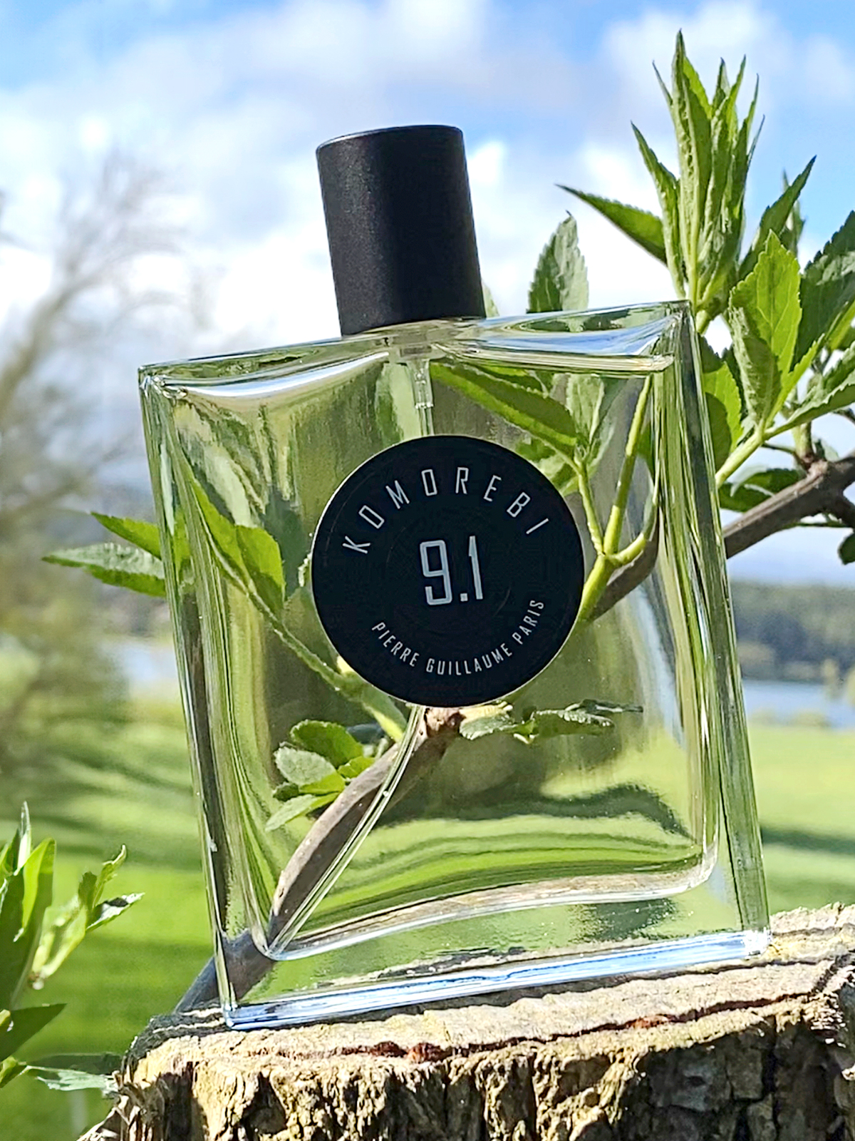
“Choosing a bottle for a new perfume house is a difficult challenge for anyone trying to project it over time. A form of classicism, of sobriety, seems to be a reasonable direction. The term ‘minimalist’ is overused and vague, so I opted for accuracy and precision. The function will be the sole muse of the design: to contain and show what is essential: the fragrance.”
Pierre GUILLAUME
A Screen Bottle
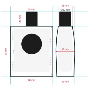
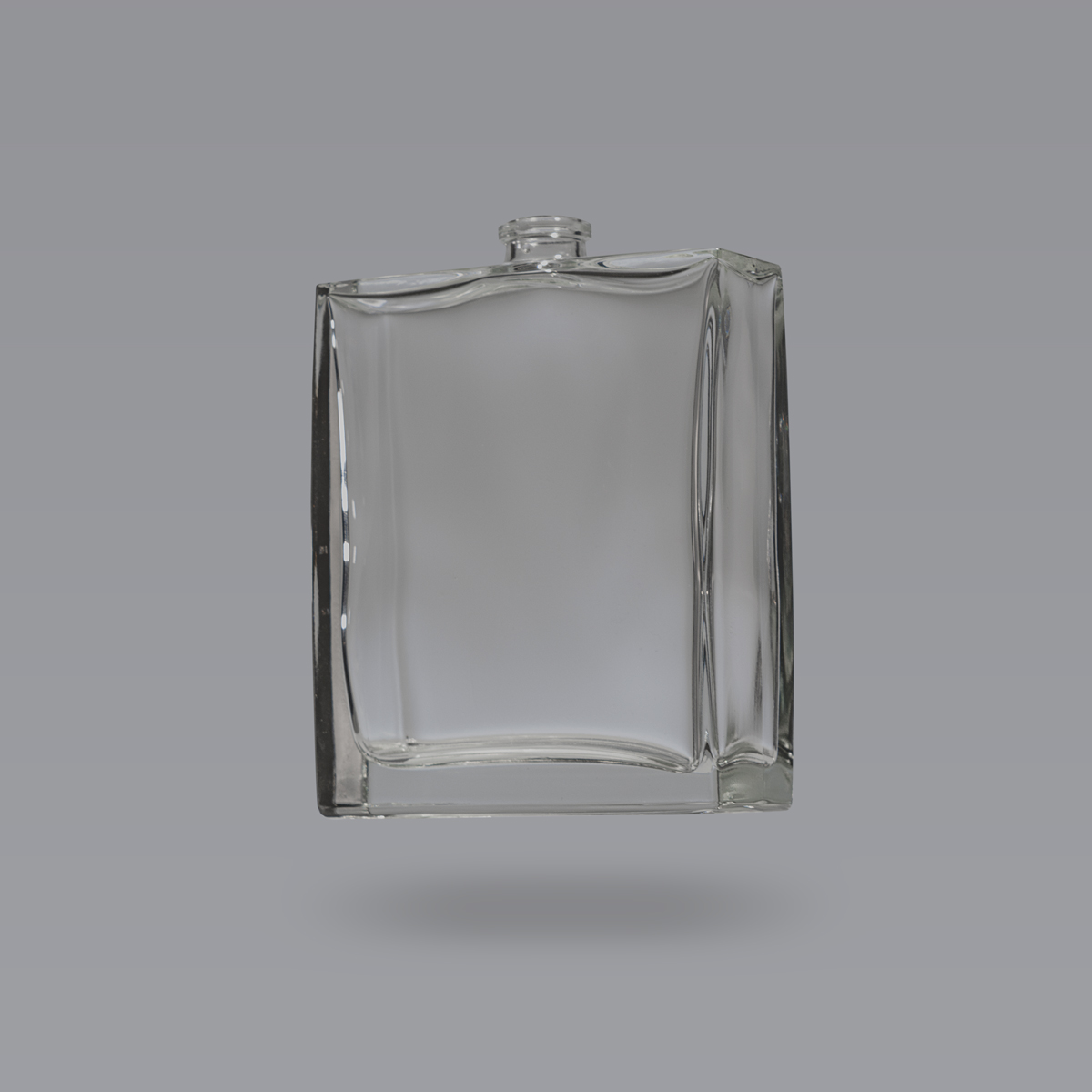
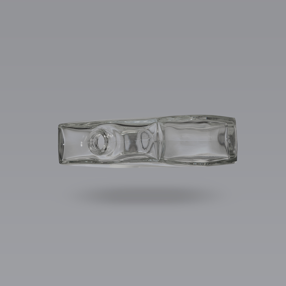
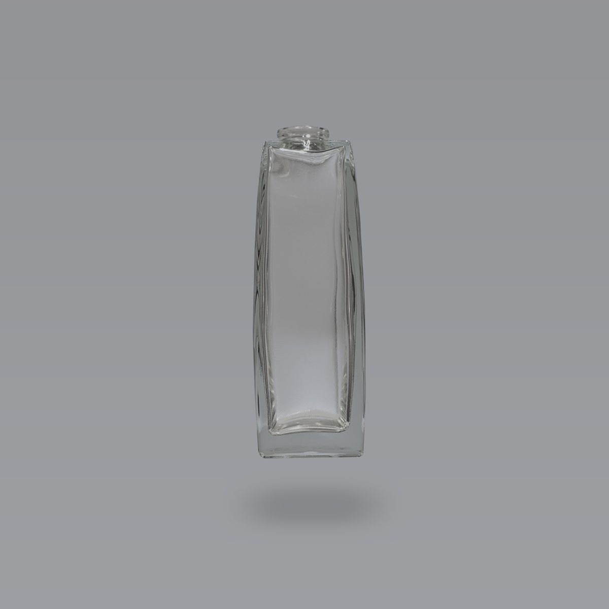
A rectangular face contrasting with subtly curved sides, at ease in both men’s and women’s hands. Inner edges reduced to the very limit of technical constraints, making this bottle nothing more than a screen over a liquid poem, a window onto the essence and the essential.
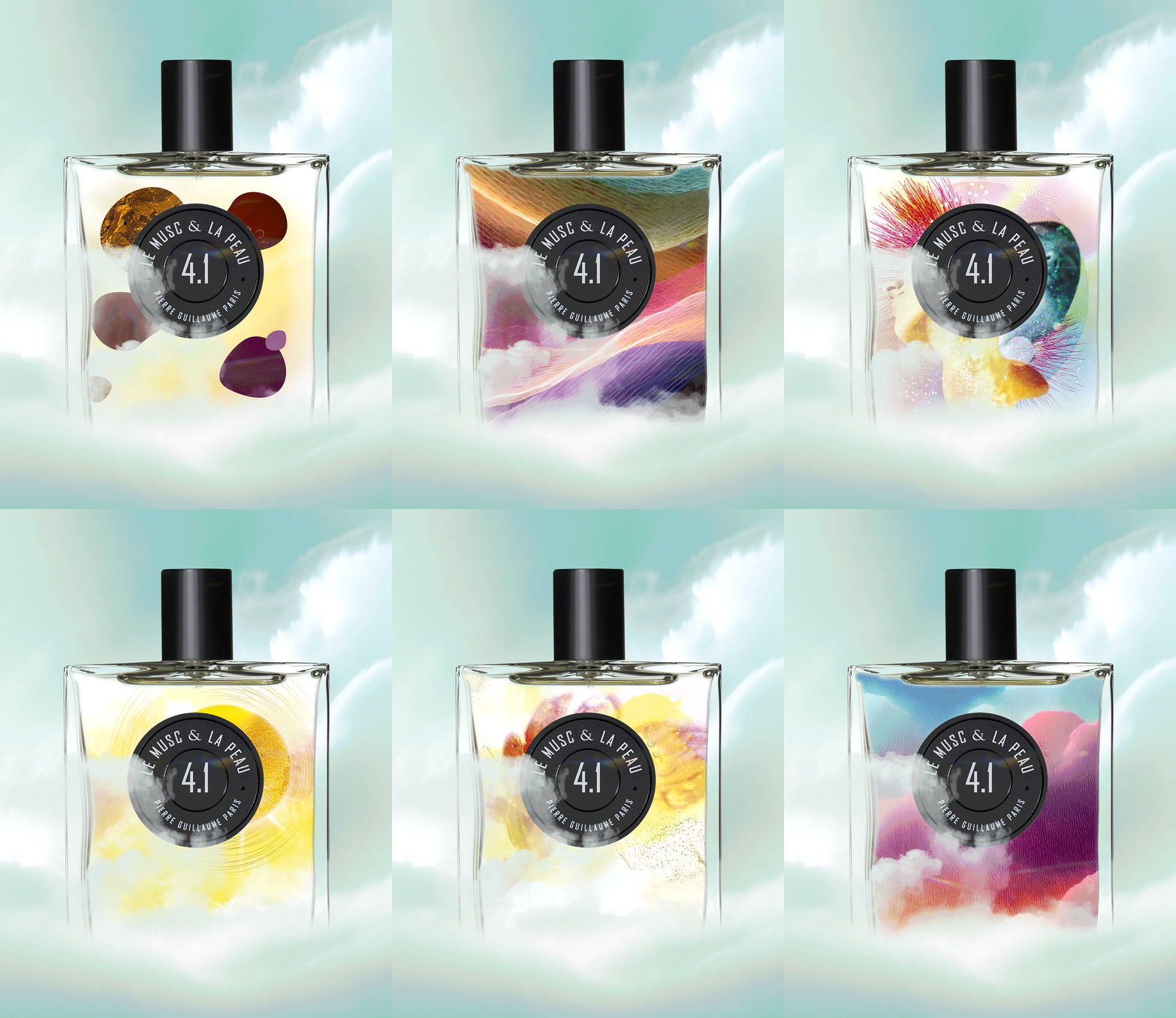
“Precision and accuracy: containing and showing what is essential”
A PENCIL STROKE “EX TEMPORE”
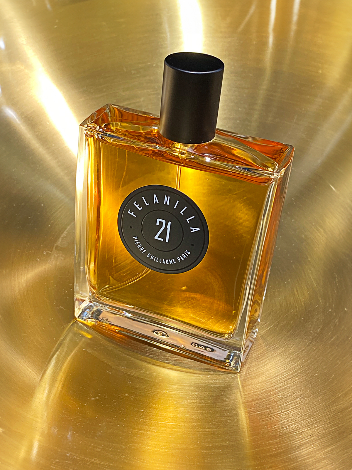
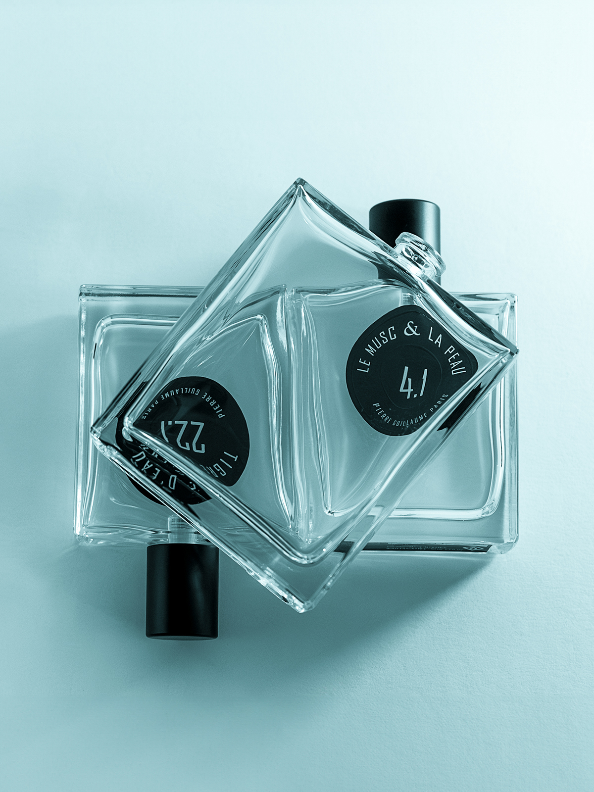
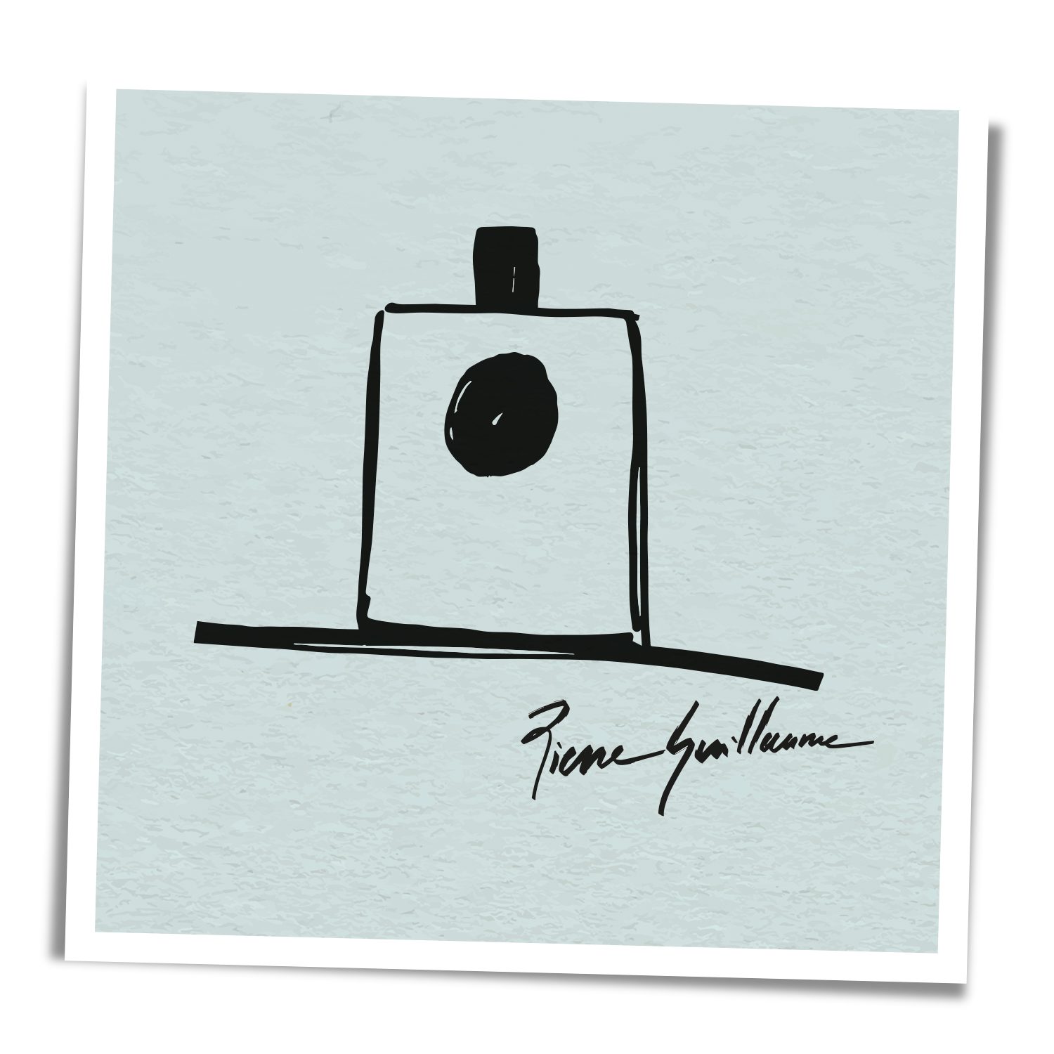
Capped with a discreet cylindrical cap and a roundel 35 mm in diameter displaying the fragrance’s title, our bottle is an easily identifiable silhouette, an ex tempore pencil line, a logo bottle, an emblem bottle.
An ecological and environmental conscience from 2005: glass bottle, labels and pump can be easily removed for easy recycling. A featherweight cap with a combination of aluminium and plastic weighing just 2.7g: an example of sobriety.
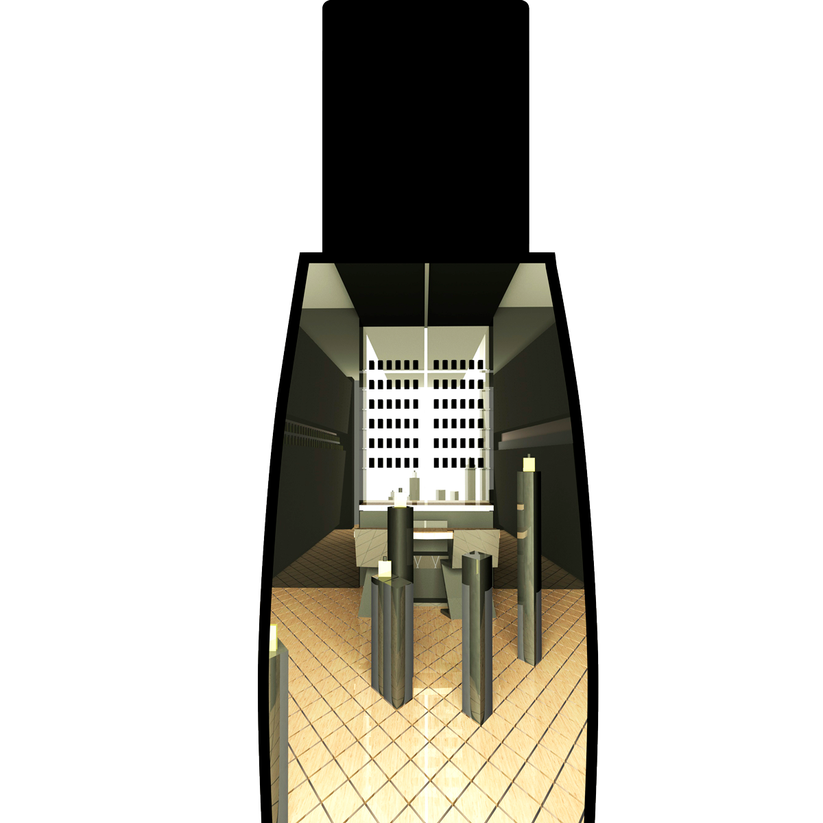
FUN FACT: The long, narrow boutique at 13, rue Jean-Jacques Rousseau was designed as a horizontal section of the side of our bottle, giving rise to the sloping walls on the first level.
